Apple Podcast’s Anniversary Graphic Blends Design and Illusion
Apple Podcast recently celebrated a milestone anniversary, and in classic Apple fashion, the celebration came with a striking visual twist. The company unveiled an anniversary graphic that’s far more than a branding gesture—it’s an optical illusion that cleverly plays with perception while reinforcing the brand’s long-standing commitment to design excellence.
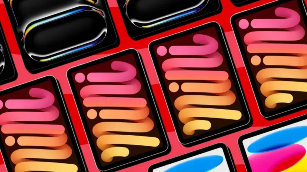
The visual, a typographic design that seemingly defies flat dimensions, is a masterclass in motionless movement. When you glance at it, it feels animated. When you look again, it’s static. This paradox is what makes it so memorable—and why the Apple Podcast anniversary art has gained attention beyond design circles.
The Power of Design in Audio Branding
You’d think a platform focused entirely on sound wouldn’t rely so heavily on visuals—but Apple proves otherwise. Over the years, Apple Podcast has become one of the most recognizable platforms in digital audio. From its purple icon to its slick, minimalist app interface, branding plays a key role in how Apple maintains its dominance in the podcasting space.
The new optical illusion graphic showcases that audio products still benefit tremendously from strong visual identity, especially in an ecosystem where user experience extends from the screen to the speaker.
Honoring 20 Years of Podcasting Innovation
As Apple Podcast celebrates its 20th anniversary, the platform takes this opportunity to recognize the creators who have fueled its growth and cultural impact. Whether you’re a longtime host or just starting your first show, this moment commemorates the dedication and creativity that define the medium.
Over the past two decades, podcasting has become a global channel for bold ideas, new formats, and community-driven content—thanks to the passion of creators worldwide. Apple emphasizes that building a meaningful podcast requires more than just recording—it demands imagination, persistence, and attention to storytelling craft.
More than a platform, Apple Podcast has positioned itself as a creative home—one that amplifies diverse voices and offers the tools needed to grow and connect with audiences. Millions of listeners have had their daily lives enriched by the work of podcasters across genres.
As Apple puts it, this milestone is a thank-you to all the creators who have made podcasting a global force. And with this celebration comes renewed excitement for what lies ahead.
🔗 Visit the official Apple Podcasts page
What Makes the Graphic So Effective?
At first glance, the anniversary graphic appears to have motion—like it’s swirling inward or pulsating outward. But it’s a static image, using high-contrast lines and radial balance to trick the eye. This optical illusion pulls in the viewer, prompting closer inspection and deeper engagement.
The result is not just aesthetic, but functional: it causes users to pause, reorient their attention, and engage more fully with the brand. In a digital world where attention is currency, this is a powerful win for Apple Podcast.
A Celebration of History and Momentum
The timing of the graphic coincides with the broader growth of Apple Podcast over the last several years. Since its 2005 debut, the platform has evolved from a simple distribution tool into a full-featured content marketplace with premium subscriptions, curated recommendations, and creator tools.
This design represents more than a birthday—it signals Apple’s ongoing momentum in podcasting. With increased competition from Spotify, Amazon, and YouTube’s audio initiatives, Apple Podcast is making a statement: “We’re still leading—and innovating visually while doing so.”
Implications for Design and UI/UX Professionals
For developers and designers working in audio or media applications, Apple Podcast’s graphic highlights a broader trend: visual branding matters, even for audio-first platforms. The illusion tactic used here could be leveraged in other areas like:
-
App onboarding screens
-
Custom loading animations
-
Brand campaign visuals
The lesson: attention-grabbing, thought-provoking visual design increases brand recall—even in domains where visuals aren’t the main product.
Reinforcing Apple’s Design DNA
What makes this illusion particularly effective is its subtlety. It doesn’t scream “optical trick”; it invites discovery. That approach is deeply rooted in Apple’s broader design philosophy—products and graphics that delight through depth, not just surface-level flash.
For Apple Podcast, this means continuing to blend the invisible (audio storytelling) with the visible (UI, iconography, and brand art). The result? A cohesive experience that feels distinctly Apple, from your first tap on the purple icon to your final listen of the day.
The Broader Ecosystem Effect
From a hardware perspective, this kind of branding enriches Apple’s device ecosystem. A polished visual like this pairs beautifully with Apple’s high-resolution displays—whether it’s on a MacBook, iPad, or iPhone. The illusion relies on screen quality and pixel density to achieve its full effect.
This means that part of the experience is inherently hardware-enabled—adding subtle but meaningful value to Apple’s physical devices through software design and media presentation.
Competitive Differentiation in the Podcast Wars
In the ongoing battle for podcast dominance, Apple Podcast faces fierce competition. Spotify has aggressively pursued exclusive deals, Amazon is bundling audio with Prime, and YouTube is doubling down on podcasts with visual-first formats.
But Apple continues to lean into its strengths: seamless integration, premium design, and now—clever visual storytelling. While others chase content deals, Apple elevates the user experience, proving that brand identity isn’t just about logo placement—it’s about how every element of the platform feels, looks, and functions.
Final Thoughts
The Apple Podcast anniversary optical illusion graphic is more than a celebration—it’s a subtle show of strength. It reinforces the power of design in shaping how users perceive and interact with a platform, even when the platform’s main product is sound.
As competition intensifies in the podcast space, Apple is quietly reminding the industry that design still wins. And for developers, designers, and hardware enthusiasts, it’s a clear signal: branding isn’t just what you say—it’s how you’re seen.
Stay Ahead in Tech
📡 For more design innovation and media tech insights, visit: https://kodecraze.com/news/